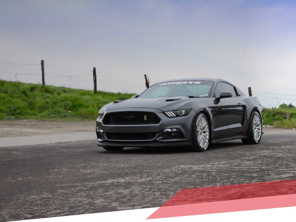
Dutchak Scrap
SERVICE
Website and Brand Identity
ROLE
Art Direction
Branding
Development
Animation
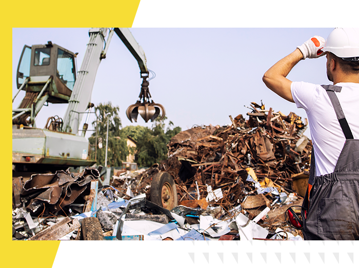
We Give A Scrap
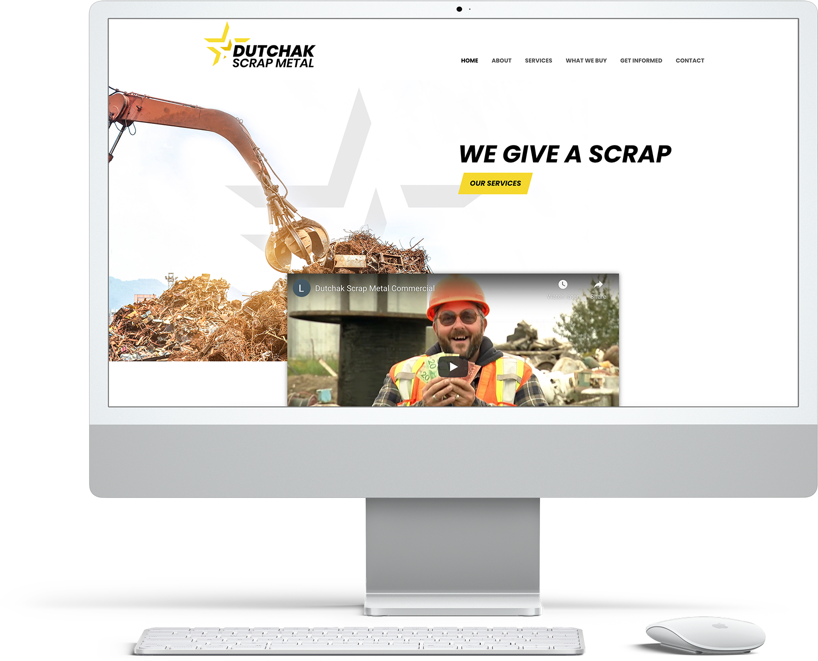
In 2021, Dutchak Scrap contacted us as their website required a facelift. Here at Digital Mammoth we designed and developed a slick new modern and responsive website for Dutchak Scrap. The new site is easy to navigate, mobile responsive, uses parallax, and we added animation to catch the users eyes.
We were also tasked to work on their branding to design a new and modern logo that will be effective across all branding materials.
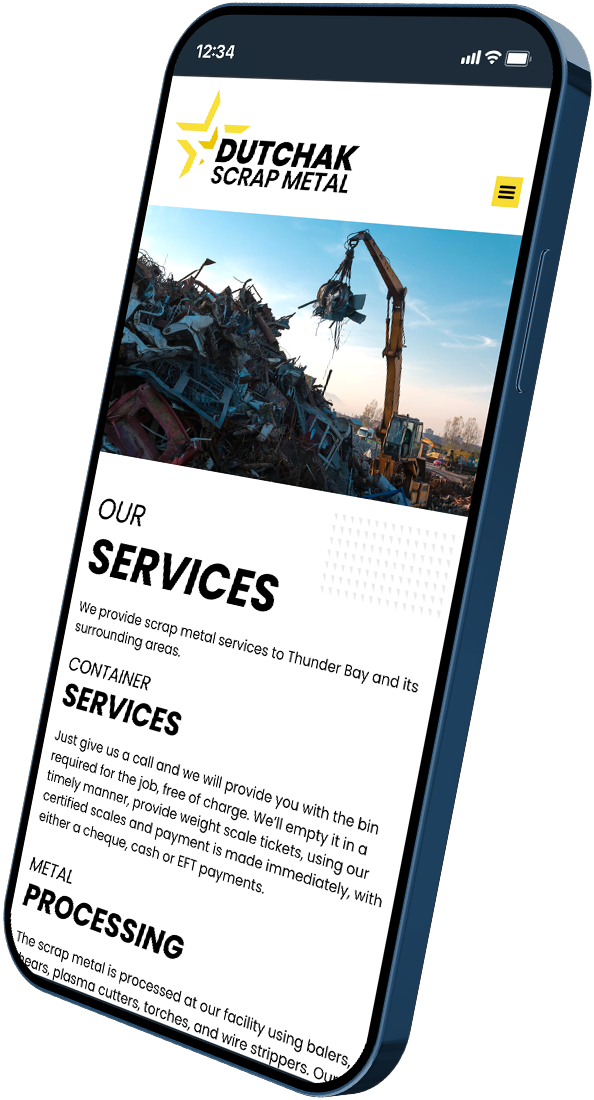
Mobile in Mind
All Digital Mammoth websites are designed to be mobile responsive, so users get the same great experience no matter what device they are on.
Colour Palette
Dutchak Scrap’s primary colours are yellow, dark yellow, and black. Yellow evokes feelings of happiness and optimism.
Typography
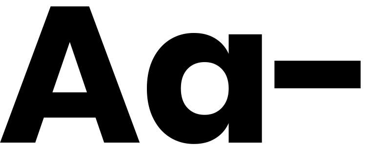
The font for Dutchak Scrap is Poppins, a geometric sans serif typeface.
Poppins
Why Poppins?
We chose Poppins as the primary font for Dutchak Scrap because it is geometric in style, clean, and includes 18 different font weights, from thin to black. Because of the range of font styles and the font’s open feel, Poppins is great for both headlines and paragraph copy to improve readability and style.

